Corporate compliance… can I hear a yawn? That’s how most employees feel about the regular compliance learning they have to go through. It is an issue. People’s brains turn to zombie mode as they work out the quickest possible ways to click through the information, or not look like they are taking a quick nap while a compliance officer gives a presentation. Que Catapult. Catapult is a program that presents your compliance in an engaging way. By utilising visual cues, interactivity and gamification, as well as some sassy video dialogue, Catapult hopes to make the process of keeping up to date with your company policies easier to digest. Given the complexity of information and processes within a company, there will be a bespoke version of Catapult for each company.
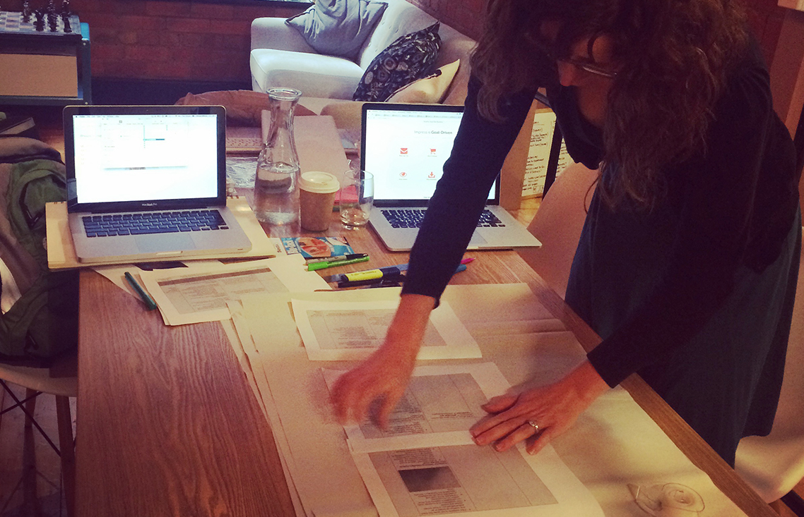
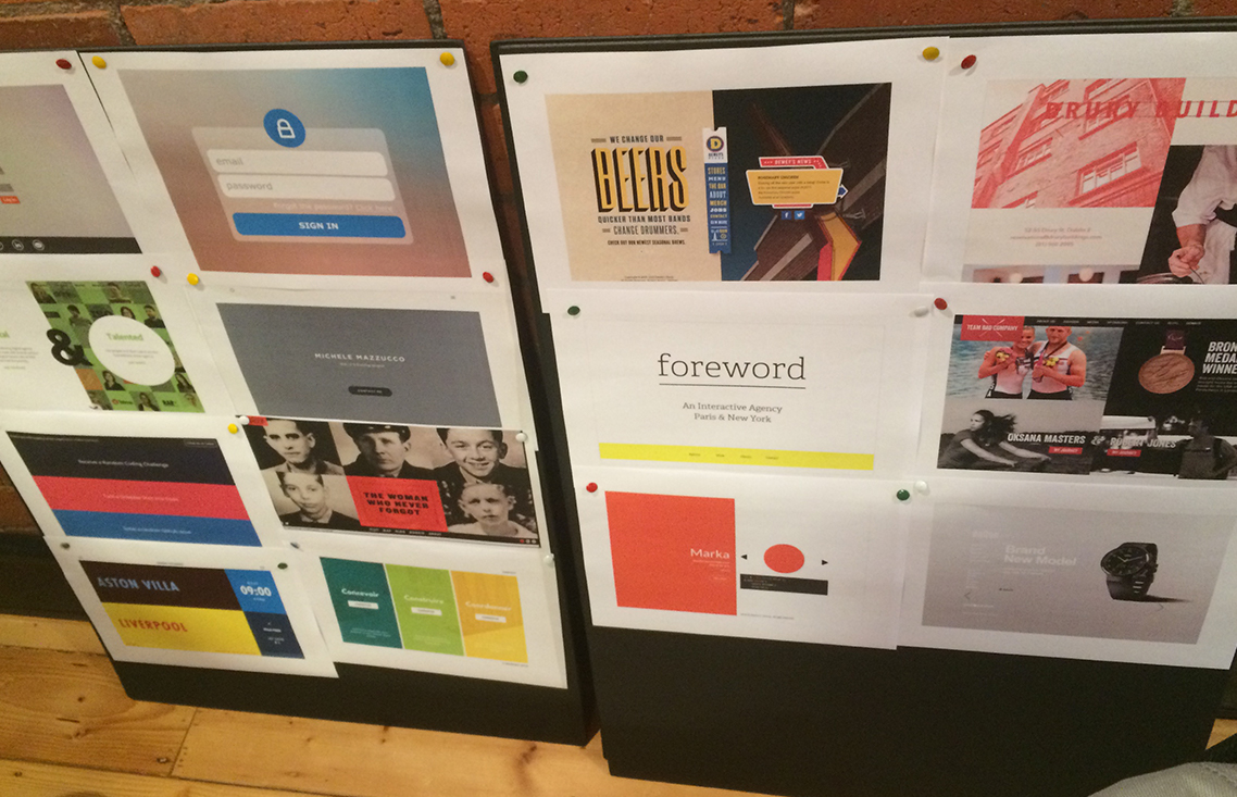
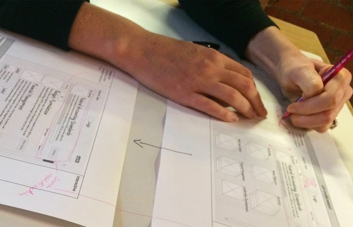
I worked with the team at Catapult to create this idea prototype. The turn around was quite quick given the amount of illustration and content to simplify. The product manager and I did a day workshop to pump out the wireframes, and then I went ahead and styled it. A lot of thought went into the interactivity and animations within illustrations and transitions.
---
Client:
Techsquish
---
Time Frame:
Two Weeks
---
Responsibilities:
Branding
User Interface Design
Wireframing
---
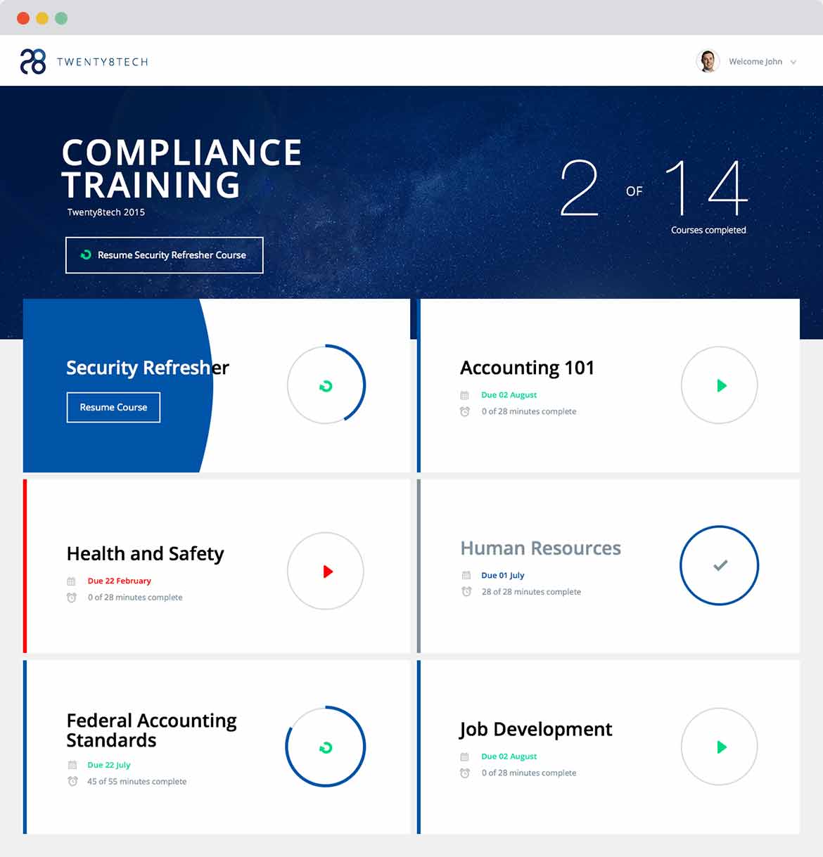
THE DASHBOARD
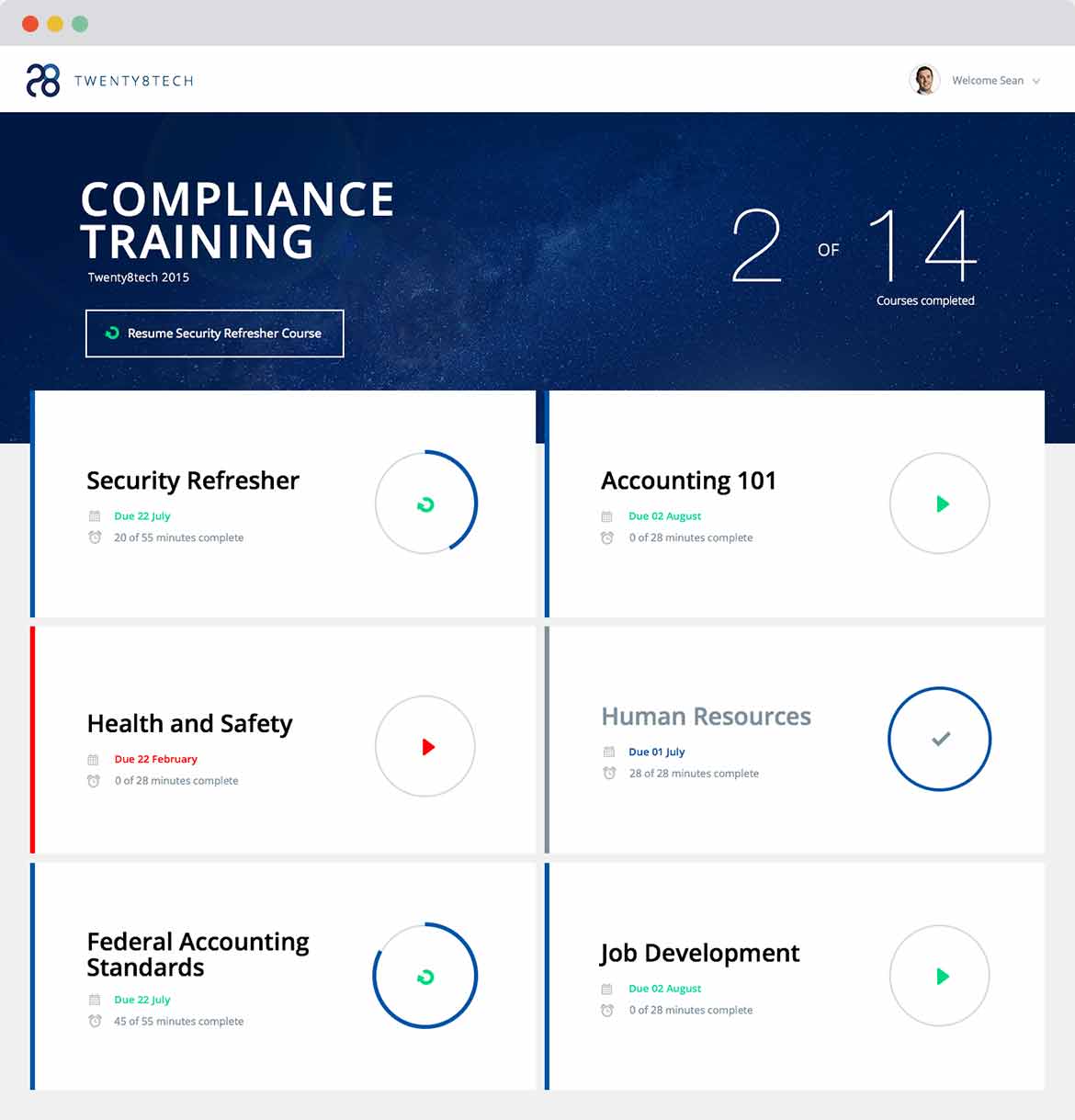
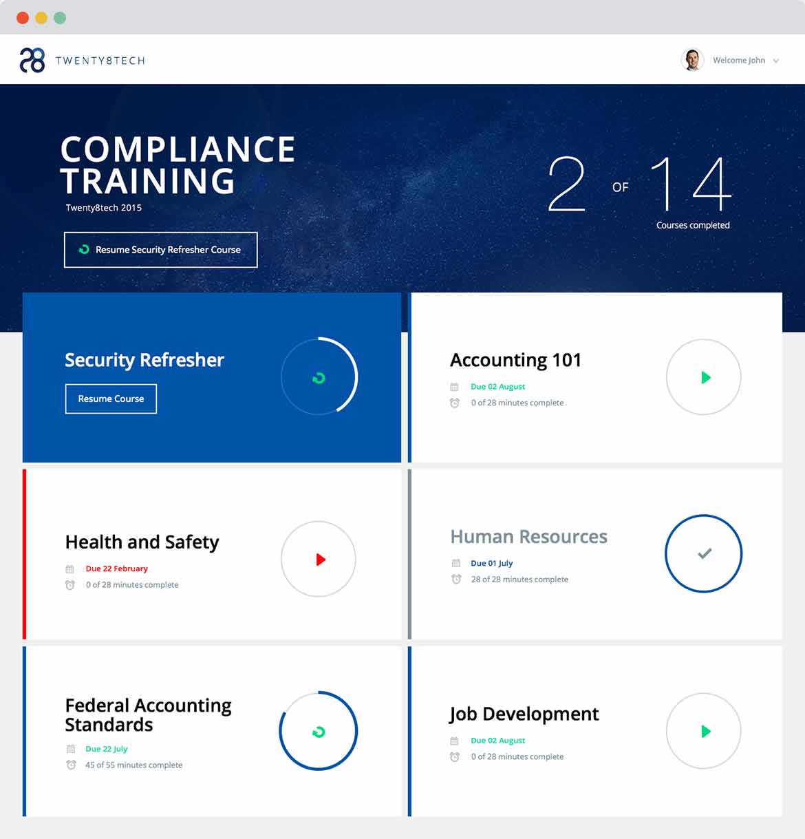
The dashboard is the first page employees see when they sign in. It is a dynamic page helping them always know what to do next. It shows them what they are working on, what they have flagged and what needs urgent attention. The purpose of the dashboard is to take away unnecessary decision making and lead them to the next course they need to go through. It also visually shows them how much they have done encouraging them to complete the courses. It is the first page they start to see some cool animations: when they mouse over a course a blue background pops over from the left.
THE COURSES
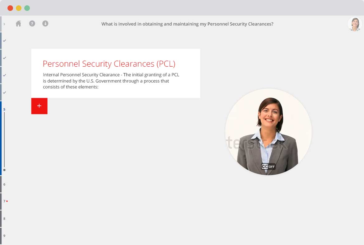
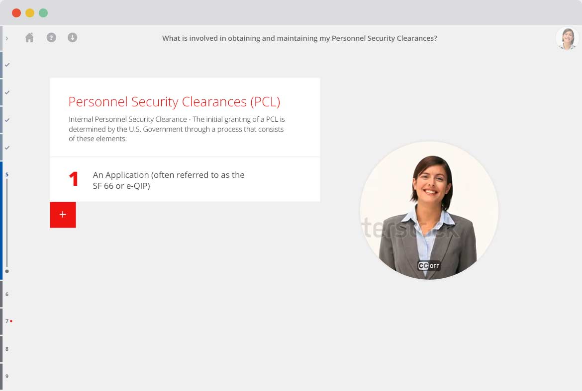
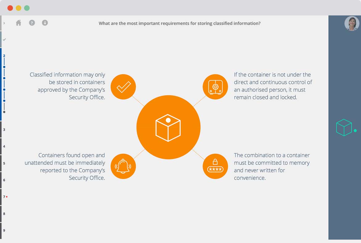
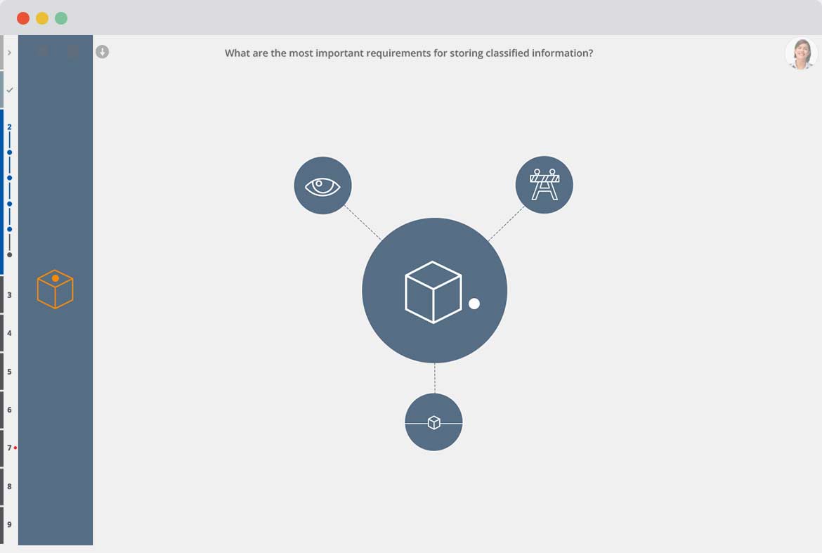
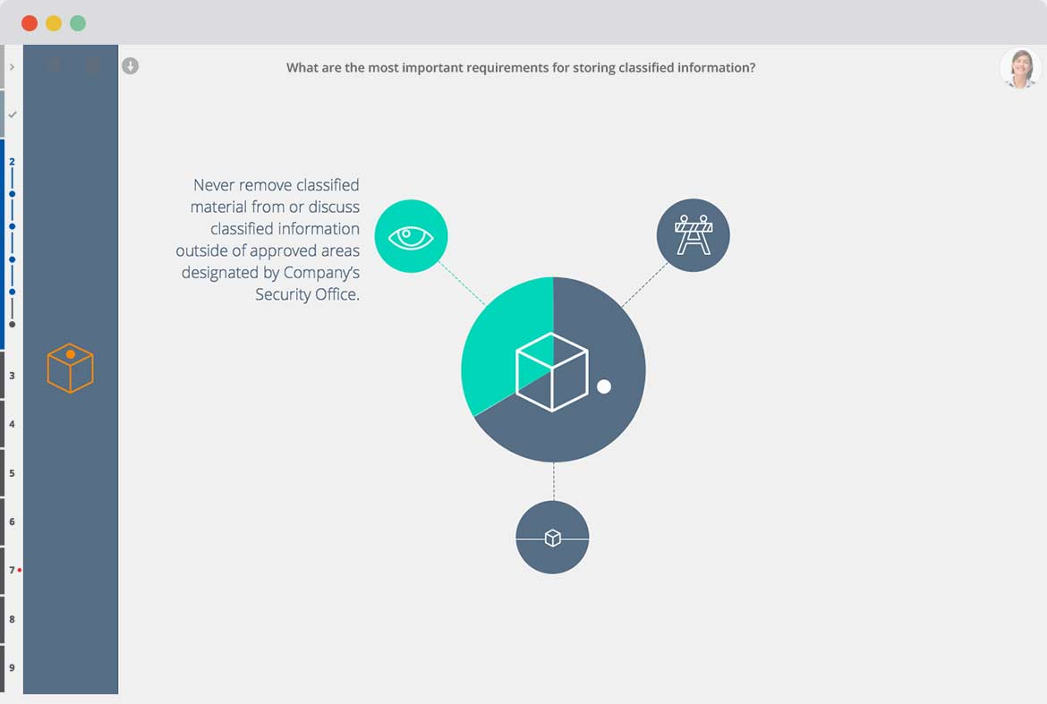
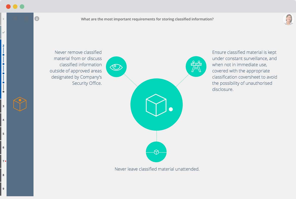
Humans are visual creatures. Pairing information with visuals helps us process the information quicker, and gives us visual memories to tag that information with. This coupled with interactivity is a powerful way to increase information retention. These are the principles that guided me as I designed Catapult. Each section of the course is different, stimulating the brain with something new. The user is led through the information by pulsing boxes, arrows and plus signs, forcing them to ingest the information bit by bit. Through the menu on the side, they always know where they are and how long they have to go. They can leave the course at any time and come back to it - it will simply reorder their dashboard to make sure they don’t forget it. Upon completing the course they get a certificate, and depending on the company, a fun reward.
When they first click in on a course they are greeted with an introduction video that outlines what they will learn. The person in the video helps them out all the way through the courses. The dialog is very important here, needing to be informative yet friendly with a hint of fun.
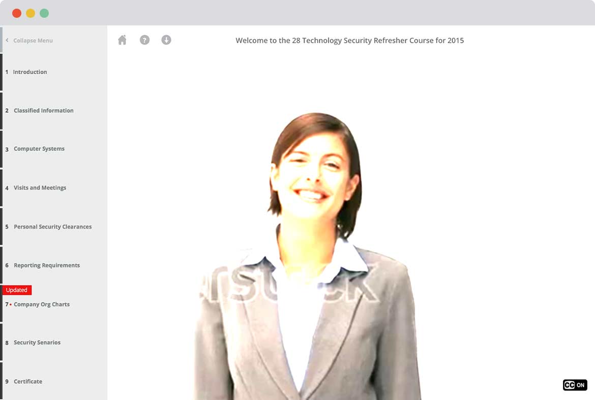

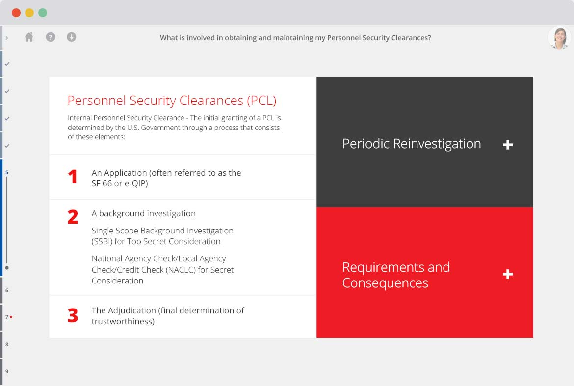
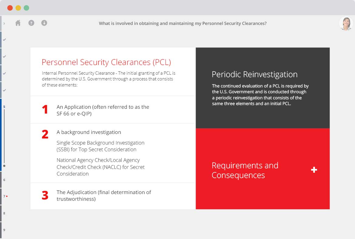
The video support also pops up within sections. They can easily click the video on or off. When it is off it moves to the top right corner of the course. In this part of the course a pulsing plus sign leads them through the information. Keep in mind below are just still images of the design, and do not fully indicate the animations throughout the site.
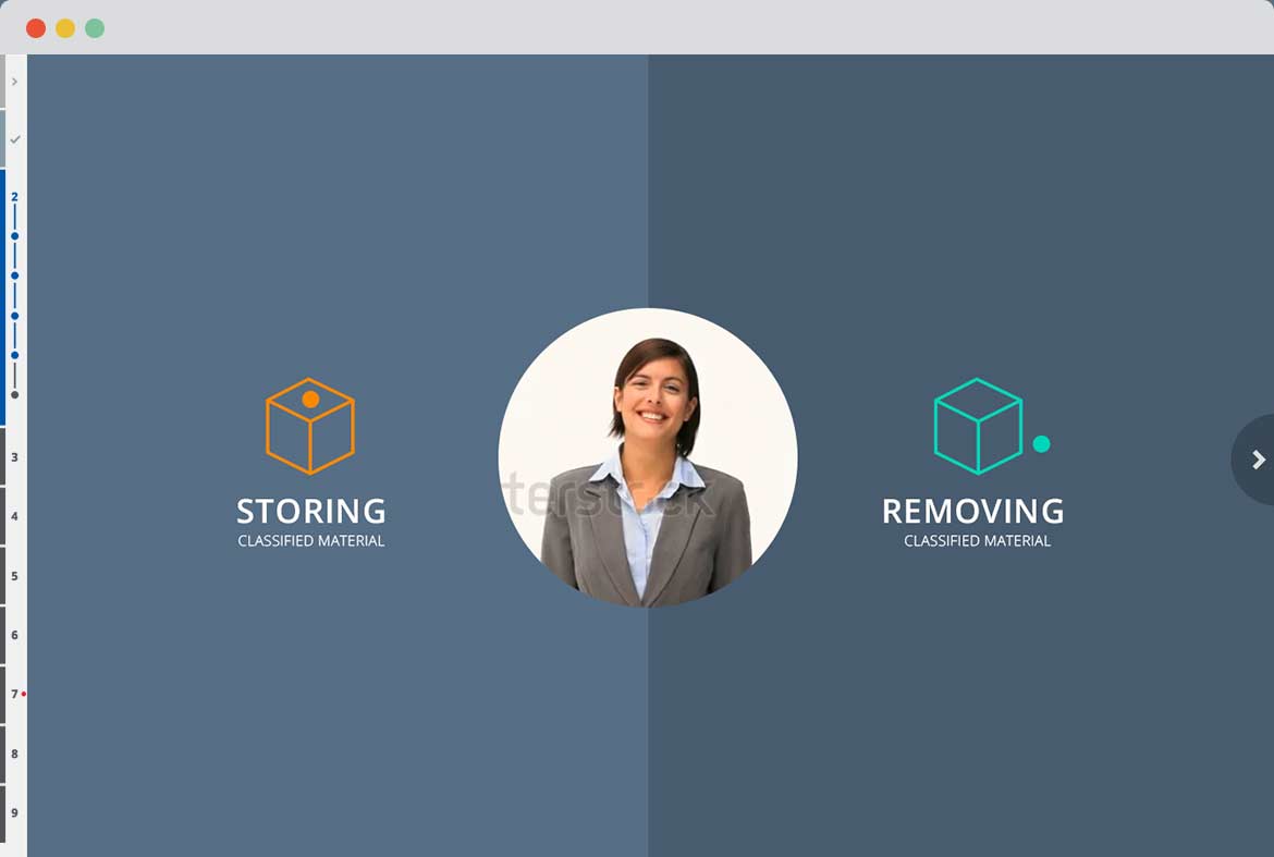
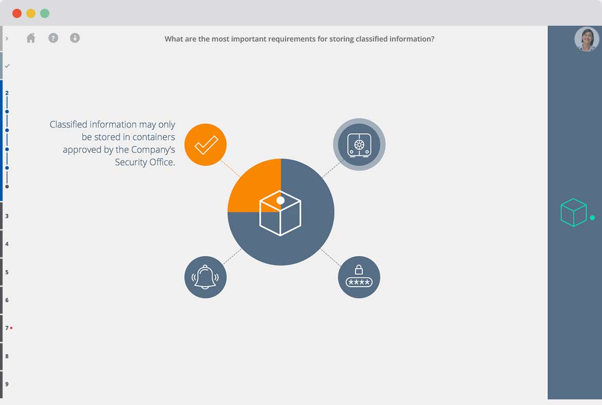
Mousing over either side of the screen creates animations, encouraging users to click in. Once they click into this section, the grey slides over to reveal the illustration with pulsing circles that lead them through the information.
THE WORKSHOP
