


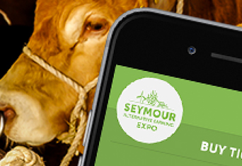
The Seymour Alternative Farming Expo needed a fresh website to help attract new people to their event. Light Creative designed a new brand for them, and then handed it over to me to design the website. Working quickly, I fleshed out their target market, listed the homepage goals, and created a sitemap. I identified how many templates and pages were needed.
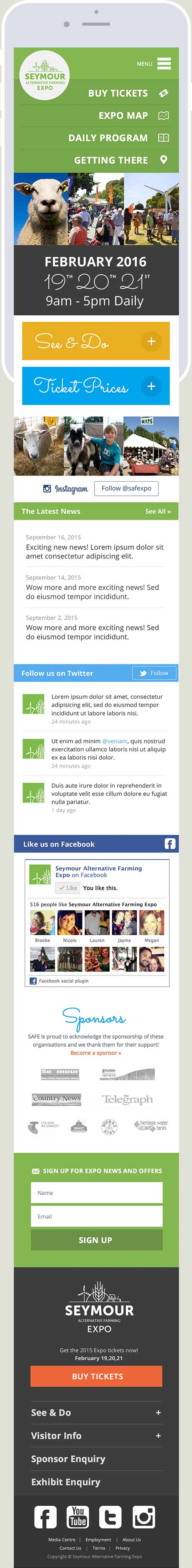
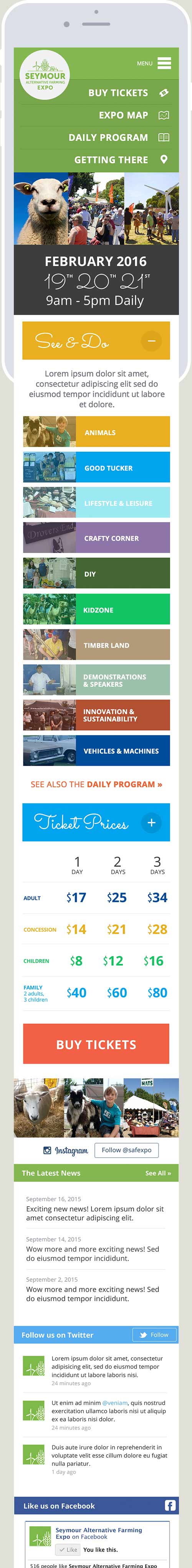
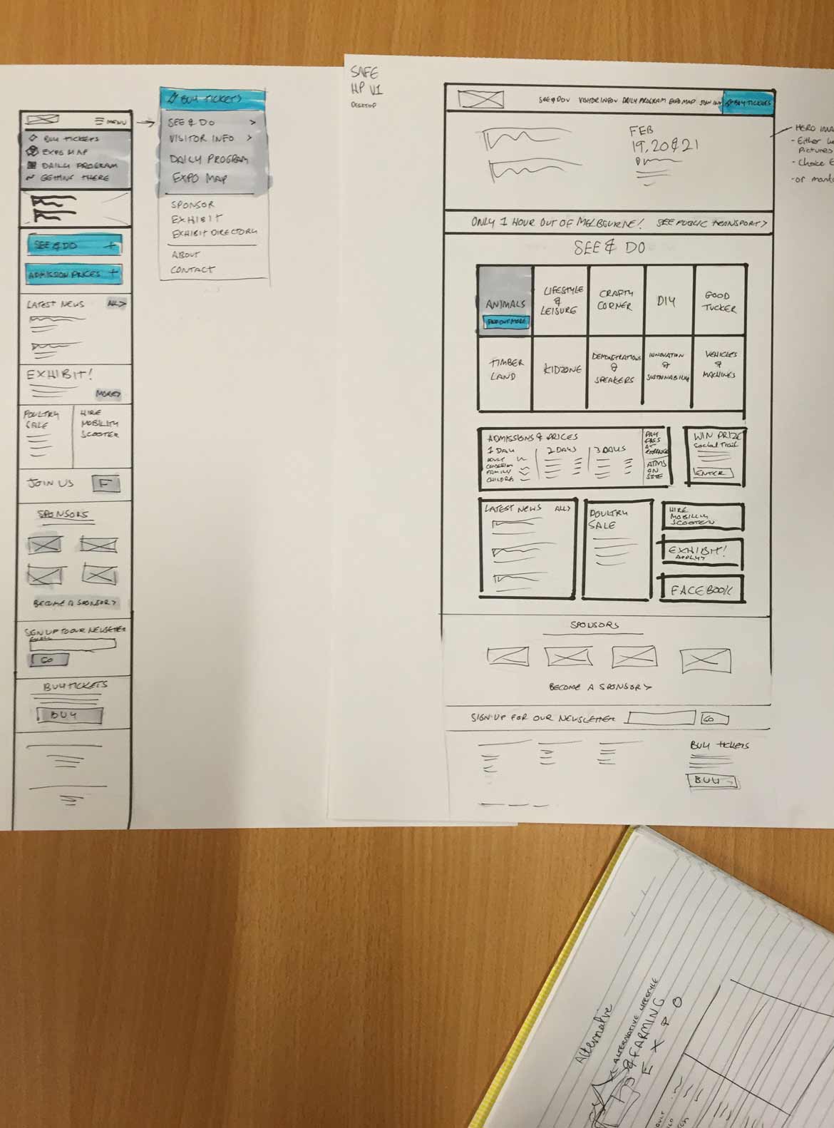
I created some wireframes so the client and I could decide on the information hierarchy, and I explored the navigation on desktop and mobile, knowing users would be visiting the website in different contexts.
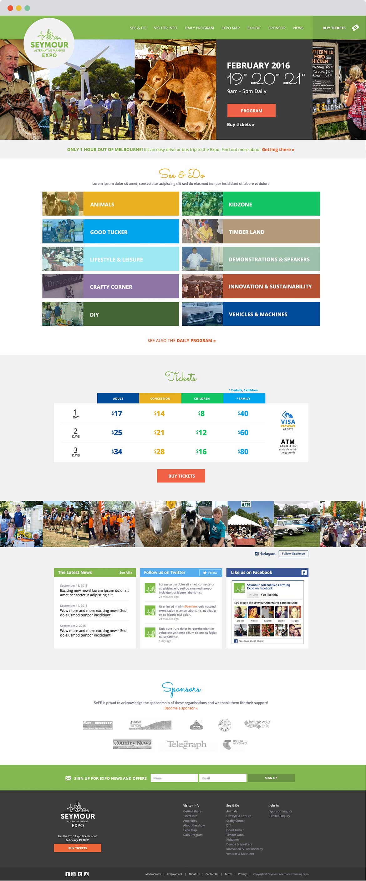
The expo is about community and sharing, so I designed an instagram feed into their homepage, along with other social media widgets, to ensure everyone could connect and get excited about the day.
The next step would be to improve the program and expo map, making it easier to interact with, especially on mobile. The website has been a vast improvement for the expo goers. They can now purchase tickets online, easily access the program and events and find out more about becoming an exhibitor or sponsor.
---
Client:
Light Creative
---
Time Frame:
Two Weeks
---
Responsibilities:
User Interface Design
User Experience Design
---
View Site
HOMEPAGE
I focused on introducing the expo, and then thought about the information and call to actions users would look for, such as the date and location of the expo, the program, ticket purchase, how to get there, and for some users how to exhibit. I made sure all of these call to actions where found in numerous places on the homepage, with the most important one, ticket purchase appearing 4 times throughout the page. I wanted the users to effortlessly find what they needed.
MOBILE
The website is device responsive. Knowing that many users visit the website on their mobile when they travel to the event, or when they are at the event, I designed the main navigation to change on mobile. Instead of hiding the main call to actions in the hamburger icon, they are already open on the homepage, meaning users can swiftly view the expo map or work out how to get there.
WIREFRAMES
These are some quick sketches I used as a talking piece with the client. They were happy with this as they could understand my intentions with the design. It allowed us to make changes to the information architecture early saving time later on the design.
View the full design at www.seymourexpo.com.au